To celebrate this year’s Day of DH (#DayOfDH20201), I want to share this draft tutorial for mapping multilingual bibliographic data sets with R.
NOTES
- This is a draft and I appreciate any comments, questions etc. using hypothes.is.
- This website is generated using the default GitHub pages Jekyll workflow, which does not support a citeproc plugin. The few references are, therefore, currently not formatted.
- The resulting maps have been published in their own repository.
Introduction
Large bibliographic dataset such as the one compiled by Project Jarāʾid (Mestyan, Grallert, and et al. 2020), which comprises information on more than 3300 periodical titles, are far too large and unwieldy for manual analysis. One wants to use descriptive statistics and visualisations for a first exploration of the data set, which can then guide further scrutiny and create new research questions. Basic information for each periodical in the Project Jarāʾid data set (with very few exceptions) include the date of the first publication as well as a publication location and additional languages beyond Arabic for bi- or even multilingual periodicals. Such a data set lends itself to mapping in order to see the distribution of the number of periodical titles per location for a certain period and region. In order to visualise change over time, one will want to animate the map in some way, just as the ones below:
These GIFs combine multiple maps into a single animation and show the geographic distribution of new periodical titles in rolling periods of different length (year and five years). This coloured information is overlaid on a greyed-out accumulation of all new periodicals since the beginning of the Arabic periodical press in 1799.
There are three distinct steps for producing these animated GIFs:
- Compile geo-referenced publication data from the source .
- This is done with XSLT.
- It runs on the bibliographic data set, which is serialised as TEI XML, pulls in geo-spatial data from an authority file also serialised as TEI XML, and writes everything to a CSV file.
- Filter and aggregate by period and region and map this data.
- This is all done with R and in RStudio, utilising the tidyverse and the visualising power of the
{ggplot2}library. - The input is the CSV file from the first step, output are images of maps (PNG).
- This is all done with R and in RStudio, utilising the tidyverse and the visualising power of the
- Animate the maps
- This is done with the command-line tool ImageMagick
- ImageMagick allows to combine images, such as our maps, into animations, which can be saved as GIF or movie files.
This tutorial will primarily focus on data filtering, aggregation and mapping in R. However, we need to look at the available data first.
1. Compile geo-referenced publication data
In order to map the number of publications by location and for a specific period, we need publication data that provides such information in a machine-readable form. Locations must be provided with geo-spatial coordinates (latitude and longitude) and dates should be normalised to the Gregorian calendar.
The bibliographic data in Project Jarāʾid and OpenArabicPE is modelled following the Text Encoding Initiative (TEI) and serialised in XML. Each periodical is modelled with a <biblStruct> following this exemplary pattern of the entry for the journal Lughat al-ʿArab from Baghdad:
<biblStruct oape:frequency="monthly" subtype="journal" type="periodical">
    <monogr>
        <title level="j" xml:lang="ar">لغة العرب</title>
        <title level="j" type="sub" xml:lang="ar">مجلة شهرية ادبية علمية تاريخية</title>
        <title level="j" xml:lang="ar-Latn-x-ijmes">Lughat al-ʿArab</title>
        <title level="j" type="sub" xml:lang="ar-Latn-x-ijmes">Majalla shahriyya adabiyya ʿilmiyya tārīkhiyya</title>
        <idno type="oape">1</idno>
        <idno type="jid">14</idno>
        <idno type="jaraid">t1r3250</idno>
        <idno type="OCLC">472450345</idno>
        <idno type="URI">http://waqfeya.com/book.php?bid=6509</idno>
        <idno type="URI">http://shamela.ws/index.php/book/36540</idno>
        <editor>
            <persName ref="viaf:39370998 oape:pers:227 wiki:Q4751824" xml:lang="ar"><roleName subtype="religious" type="rank" xml:lang="ar">الأب</roleName> <forename xml:lang="ar">انستاس</forename> <forename xml:lang="ar">ماري</forename> <surname xml:lang="ar"><addName type="nisbah" xml:lang="ar">الكرملي</addName></surname></persName>
        </editor>
        <editor>
            <persName ref="oape:pers:396 wiki:Q12234292" xml:lang="ar"><forename xml:lang="ar">كاظم</forename> <surname xml:lang="ar"><addName type="nisbah" xml:lang="ar">الدجيلي</addName></surname></persName>
        </editor>
        <textLang mainLang="ar"/>
        <imprint xml:lang="ar">
            <date datingMethod="#cal_islamic" type="onset" when="1911-06-30" when-custom="1329-07-01"/>
            <pubPlace xml:lang="ar">
                <placeName ref="geon:98182 oape:place:216" xml:lang="ar">بغداد</placeName>
            </pubPlace>
        </imprint>
        <biblScope from="1" to="1" unit="volume"/>
        <biblScope from="1" to="1" unit="issue"/>
    </monogr>
    <note type="comment"/>
    <note type="sources">
        <list>
            <item> <rs ref="#agt" xml:lang="und-Latn">Ṭ</rs> </item>
        </list>
    </note>
    <note type="holdings">
        <list>
            <item><rs ref="#hOAPE">OpenArabicPE: <ref target="https://openarabicpe.github.io/journal_lughat-al-arab/tei/oclc_472450345-i_1.TEIP5.xml">Digital full-text edition</ref></rs>, </item>
            <item><rs>Sakhrit: <ref target="http://archive.alsharekh.org/newmagazineYears.aspx?MID=14" xml:lang="und-Latn">facsimiles and (limited) index</ref> </rs>, </item>
            <item><rs ref="#hUWL">UWL</rs>: 1911-13</item>
        </list>
    </note>
</biblStruct>
This is a lot of information but here we are only concerned with the <date> and <pubPlace> nodes, their children, and their attributes that provide temporal and geographic information in machine-actionable form.
Temporal data
Both the first and final confirmed date of publication are provided as <date> nodes with @type attributes to differentiate between the two. Note that in most cases we only have information on the onset. This is due to two reasons. First, our main source, the summary tables in the fourth volume of dī Ṭarrāzī’s “History of the Arabic Press”, provides only the date of first publication and whether a periodical was still published at the time of publication of this volume (or rather its compilation).(dī Ṭarrāzī 1933) Second, endings are inherently difficult to track. Periodicals tend to start with much fanfare and to fickle out with future issues still being announced/promised in the last one we are able to track down.(C.f. Albers 2020)
Periodicals and contemporaneous sources provided publication dates according to multiple calendars, which have been computationally normalised and recorded with the @when, @when-custom, and @datingMethod. The latter points to a local definition of the calendars found in our project.
<date datingMethod="#cal_islamic" type="onset" when="1911-06-30" when-custom="1329-07-01"/>
The Islamic hijrī calendar is a lunar calendar based on the actual observation of the new moon. This means it can only be computationally approximated by computing the astronomical moon calendar. Actual hijrī dates might differ by +-2 days at any given location.
Spatial data
Publication places are provided as <pubPlace> with at least one <placeName> child holding a toponym in a language specified by the @xml:lang attribute and pointing to a gazetteer by means of the @ref attribute, where one can find more information on that specific place. In our current data model, @ref makes use of private URI schemes that point to various authority files. In the case of
<placeName ref="geon:98182 oape:place:216" xml:lang="ar">بغداد</placeName>
“بغداد” references a place with the ID “216” in our local, TEI-encoded gazetteer and a place with the ID “98182” on GeoNames. Our local gazetteer combines a number of data sources, including GeoNames, and the basic entry with the ID “216” looks as follows:
<place type="town">
    <placeName xml:lang="ar-Latn-x-ijmes">Baghdād</placeName>
    <placeName xml:lang="en">Baghdad</placeName>
    <placeName xml:lang="ar">بغداد</placeName>
    <placeName xml:lang="ar">بغداد الزوراء</placeName>
    <placeName xml:lang="ar">الزوراء</placeName>
    <placeName source="#org_geon" xml:lang="fr">Bagdad</placeName>
    <placeName source="#org_geon" xml:lang="de">Bagdad</placeName>
    <placeName source="#org_geon" xml:lang="tr">Bağdat</placeName>
    <location>
        <geo>33.34058, 44.40088</geo>
    </location>
    <idno type="url">http://en.wikipedia.org/wiki/Baghdad</idno>
    <idno type="geon">98182</idno>
    <idno type="oape">216</idno>
</place>
This entry provides two necessary bits of information: the geo-referenced location of “بغداد” and further toponyms in multiple languages written in Latin script, which reveal to those not reading Arabic that the place in question is the city of Baghdad in Iraq. The latter is also relevant for the plotting of labels on our map because a lot of software cannot correctly render Arabic script even if it is internally dealing just fine with anything that is encoded with unicode (utf-8).
Note that the actual geo-referencing of toponyms is a done semi-automatically by having a script query GeoNames and manually validating the results. Toponyms, which are not found in GeoNames are entirely manually geo-referenced if possible.
Combine data
In order to put Lughat al-ʿArab on a map, we need to combine the information from the bibliography with the location data from the gazetteer and serialise the data in a format that can be understood by the mapping software. There are multiple options for doing so but I decided to combine both steps using XSLT. For each periodical, this XSLT pulls a canonical ID, publication titles in the original script and Latin transcription, and the date of the first publication from the <biblStruct>. It then uses the @ref on <placeName> to look up toponyms and geo-spatial location data from the gazetteer. The output is a simple CSV file and the line for Lughat al-ʿArab looks thus:
"id","title.orig","title.Arab","title.Latn","language.main","language.other","date.onset","date.terminus","location.id","toponym","toponym.Arab","toponym.Latn","lat","long"
"jaraid:t1r3250","لغة العرب","لغة العرب","Lughat al-ʿArab","ar","NA","1911-07-01","","geon:98182","Baghdad","بغداد","Baghdād","33.34058","44.40088"
NOTE: One could also keep the bibliographic and the spatial data separate join them in R or Python using the IDs from the @ref attribute. However, I think working with XML in R is not as neat as using a native X-Technology such as XSLT. This means that I am anyway running some XSLT to convert the data into a format more easily ingested with R, such as CSV. Outputting two different CSVs to later combine them in R seemed like an unnecessary additional step.
2. Filter and map the data with R
I map the data with R using the {ggplot2} library and the tidyverse. Although the CSV is already pretty tidy, we need a bit of preprocessing in order to be able to easily aggregate the data by location, period or region. However, we need to first load the data into R.
# load libraries
library(tidyverse) # combination of libraries that form the core of the tidyverse, including ggplot2
# libraries for mapping
library(ggmap) # vector maps in ggplot2
library(rnaturalearth) # methods to load geospatial data from Natural Earth
library(rnaturalearthdata) # geospatial data
library(sf) # library for working with Simple Features
data.jaraid <- readr::read_delim(file = "jaraid_data.csv", col_names = T, delim = ",") %>%
  dplyr::rename(
    title = title.Latn, # selects the Latin transcription of titles
    location = toponym # selects the English toponyms, if present, and Latin transcriptions of Arabic toponyms
  )
Since we will most likely filter dates based on the year only, we can create a new column year with a simple regular expression and based on the date.onset column. Note that the use of regular expressions instead of proper date functions allows us to apply it to ill-formed data.
data.jaraid <- data.jaraid %>%
  dplyr::mutate(
    year = as.integer(stringr::str_extract(date.onset, "\\d{4}"))) %>%
  dplyr::filter(language.main == "ar") %>% # be extra cautious to select only Arabic titles
  dplyr::select(
    id, title, year, location, long, lat, toponym.Arab) %>% # toponym.Arab is included to showcase R's capabibilities for rendering Arabic
  tidyr::drop_na(year, long, lat) # remove all rows without date or location data
The resulting data is a tibble and looks as follows:
# A tibble: 6 x 6
  id            title                year  location         long   lat
  <chr>         <chr>                <chr> <chr>           <dbl> <dbl>
1 jaraid:t1r1   La décade égyptienne 1799  Cairo            31.2  30.1
2 jaraid:t1r2   Al-Tanbīh            1800  Cairo            31.2  30.1
3 jaraid:t1r3   Al-Jūrnāl al-Khidīwī 1813  Cairo            31.2  30.1
4 jaraid:t1r4   Jūrnāl al-ʿIrāq      1816  Baghdad          44.4  33.3
5 jaraid:t1r5   Waqāʾiʿ-i Miṣriyye   1828  Būlāq            61.6  32.6
6 jaraid:t1r843 Akhbār al-Qāṣid      1833  Valetta (Malta)  14.5  35.9
Pre-process the data: aggregate by location
As we want to map the number of periodicals per location, we need to aggregate the data by location.
data.jaraid.aggregated <- data.jaraid %>%
  dplyr::group_by(location, lat, long) %>%
  dplyr::summarise(periodicals = n()) %>%
  dplyr::ungroup() %>%
  dplyr::arrange(desc(periodicals))
The resulting data is a tibble sorted by the number of periodicals and it allows us to see a ranking of locations by the number of new Arabic periodical titles for the entire period covered by our data set (1799–1929).
head(data.jaraid.aggregated, 10L)
# A tibble: 10 x 5
   location        lat   long toponym.Arab periodicals
   <chr>         <dbl>  <dbl> <chr>              <int>
 1 Cairo          30.1  31.2  القاهرة             1104
 2 Beirut         33.9  35.5  بيروت                317
 3 Alexandria     31.2  29.9  الإسكندرية           213
 4 Baghdad        33.3  44.4  بغداد                173
 5 Damascus       33.5  36.3  دمشق                 142
 6 Tunis          36.8  10.2  تونس                 126
 7 Aleppo         36.2  37.2  حلب                   71
 8 New York City  40.7 -74.0  نيويورك               55
 9 Paris          48.9   2.35 باريز                 52
10 Istanbul       41.0  28.9  الأستانة              51
This basic, sorted tibble of locations allows for an important observation: three of the ten most prominent places for the publication history of Arabic periodicals lie outside predominantly Arabic-speaking regions: New York, Paris, and Istanbul. We can assume that the latter gained its prominence from being the capital of the Ottoman Empire. Since the empire disintegrated with the end of World War I, we can probably assume that Istanbul would be even more prominent for the period ending in 1918. The following script shows that this assumption is correct.
data.jaraid %>%
  dplyr::filter(year <= 1918) %>%
  dplyr::group_by(location, lat, long, toponym.Arab) %>%
  dplyr::summarise(periodicals = n()) %>%
  dplyr::ungroup() %>%
  dplyr::arrange(desc(periodicals))


# A tibble: 153 x 5
   location        lat   long toponym.Arab periodicals
   <chr>         <dbl>  <dbl> <chr>              <int>
 1 Cairo          30.1  31.2  القاهرة              734
 2 Beirut         33.9  35.5  بيروت                199
 3 Alexandria     31.2  29.9  الإسكندرية           155
 4 Tunis          36.8  10.2  تونس                  99
 5 Baghdad        33.3  44.4  بغداد                 62
 6 Damascus       33.5  36.3  دمشق                  55
 7 Istanbul       41.0  28.9  الأستانة              51
 8 New York City  40.7 -74.0  نيويورك               48
 9 Paris          48.9   2.35 باريز                 48
10 Sao Paolo     -23.5 -46.6  سان باولو             34
Mapping in R with {ggplot2}
Mapping in R can be achieved with various libraries but I opted for the popular {ggplot2} library, which is quickly becoming the standard library for visualisations in R. {ggplot2} provides a simple yet powerful vocabulary and mechanisms for creating layered visualisations. The most basic visualisation of the above data would be a scatter plot:
# basic scatter plot
ggplot() +
    geom_point(data = data.jaraid.aggregated,
        aes(x = long, y = lat, fill = periodicals, size = periodicals),
        shape = 21, stroke = 0.2,alpha = 0.6)
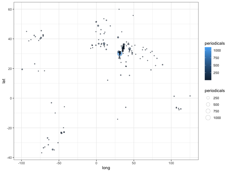
While this already represents a map with latitude and longitude being mapped to the x and y axes of a Cartesian coordinate system, it would be much more useful to have the information plotted onto a geographic map of coastlines to provide some visual reference as to where values are located.
To do so, we need to load base maps either as raster or vector data. For our goal of providing the minimally required visual clues, vector data is the preferred option as it allows us to alter its appearance by choosing line and fill colours, opacity, line sizes etc. I will, however, also briefly show how tile maps can be utilised.
Vector maps
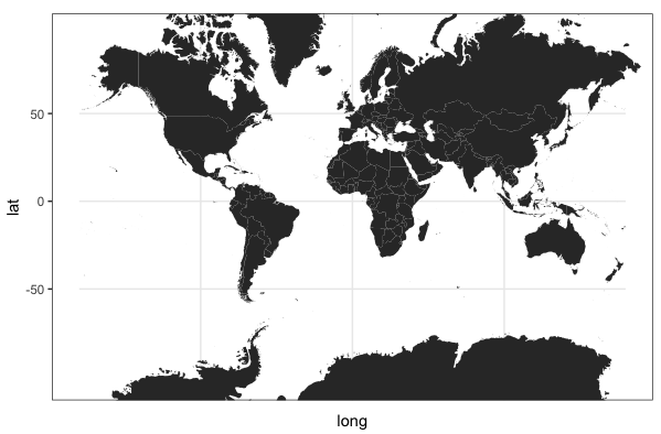
{ggplot2} provides the map_data() function that loads vectorised map data from the {maps} package. To load and plot a worldmap, we simply add a polygon layer to ggplot()
# write map to a variable
map.base <- ggplot() +
  geom_polygon(data = map_data("world"),
               aes(x = long, y = lat, group = group))
# plot the map
map.base
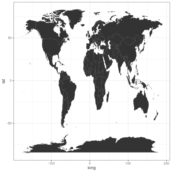
Projections
There is, however, one obvious problem with the resulting map: the relation between the coordinates is neither fixed, nor does the map adhere to a specific projection. We therefore need to add a projection to this map. The coord_map() function projects a portion of the approximately spherical earth onto a two-dimensional plane using projections defined by the {mapproj} package. The default is the Mercator projection.
map.base + coord_map(xlim = c(-180,180),
  projection = "mercator")
Note that in this case the xlim is needed to mitigate against a well-known bug in {ggplot2} that only pertains to this specific data source that would otherwise cause points above 180º to distort polygons.
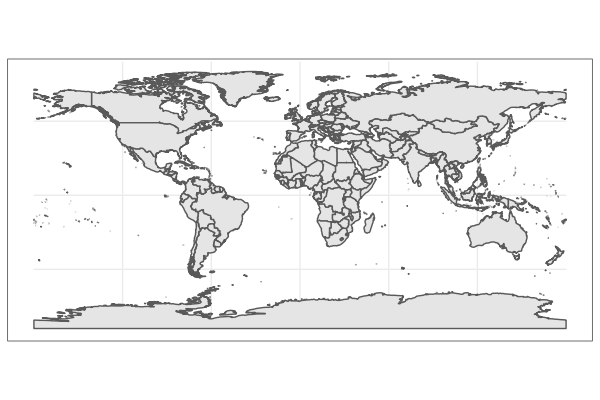
Simple features: vectorised spatial data
As we have seen, the necessary projection causes a rendering bug to distort the polygons in our base map. This base map as the additional disadvantage that although it is based on vectorised data, the polygones do not contain any spatial information as such. Both can be averted if we work with proper spatial data and the “simple features for R” package ({sf}). First we need to load some additional libraries
library(rnaturalearth)
library(rnaturalearthdata)
library(sf)
With these libraries we can now load and map spatial data from “Natural Earth”. Note that the spatial data already includes information on geographic reference systems and that geom_sf() defaults to a specific, Eurocentric view and projection.
map.sf.base <- ggplot() +
  geom_sf(data = ne_countries(scale = "medium", returnclass = "sf"))
map.sf.base
Map our data
We can now plot our data onto these base layers. Although this works with any of the base maps, we will use the Simple Features map from here on.
map.sf.base +
  coord_sf(ylim = c(-55, 70), xlim = c(-140, 150)) + # select a smaller section of the world map
  geom_point(data = data.jaraid.aggregated,
             aes(x = long, y = lat, fill = periodicals, size = periodicals),
             shape = 21, stroke = 0.2,alpha = 0.6) +
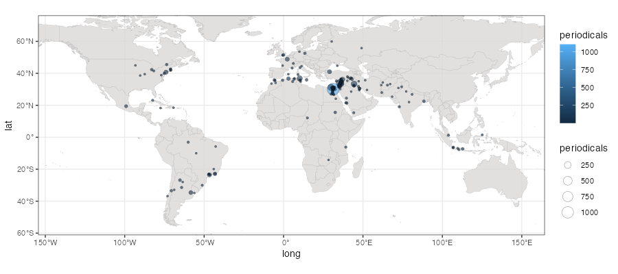
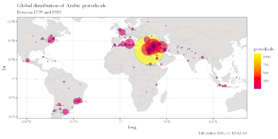
This map, while technically sufficient, is rather illegible and needs quite a few edits to improve the display and foreground the data we are interested in.
-
We need to alter the appearance of the world-map to become much more muted
map.sf.base <- ggplot() + geom_sf(data = ne_countries(scale = "medium", returnclass = "sf"), fill = "#d9d8d7", color = "#b8b6b6", size = 0.1, alpha = 0.8) -
We limit the map to the region with data points, using the
min()andmax()functions for each coordinate and adding a bit of a marginviewport.sf.data <- c(coord_sf(xlim = c(min(data.jaraid.aggregated$long, na.rm = T), max(data.jaraid.aggregated$long, na.rm = T)), ylim = c(min(data.jaraid.aggregated$lat, na.rm = T), max(data.jaraid.aggregated$lat, na.rm = T)))) -
We make the data more legible and prominent
# our periodical data layer.data <- c(geom_point(data = data.jaraid.aggregated, aes(x = long, y = lat, fill = periodicals), # explicitly calculate the size of dots size = sqrt(data.jaraid.aggregated$periodicals), shape = 21, stroke = 0.2, alpha = 0.6)) -
We add titles, captions etc.
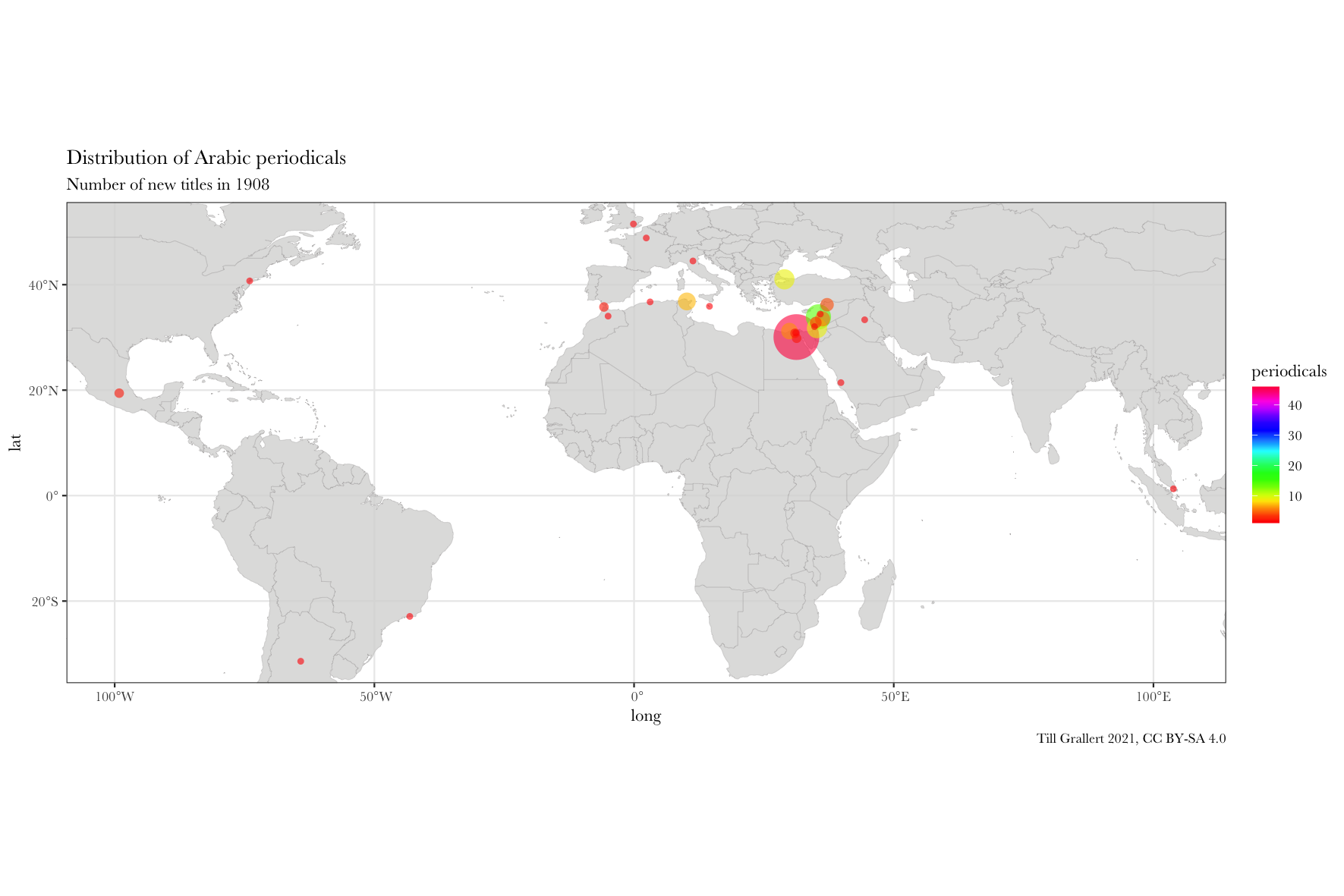
layer.labs <- labs(x="long", y="lat", title = "Global distribution of Arabic periodicals", subtitle = paste("Between", min(data.jaraid$year), "and", max(data.jaraid$year), sep = " "), caption = paste("Till Grallert ", lubridate::year(Sys.Date()), ", CC BY-SA 4.0", sep = "")) -
Finally, we plot the all these layers upon the base map.
 map.sf.final <- map.sf.base +
     layer.locations.labels +
     layer.data +
     viewport.sf.data +
     layer.labs +
     # set colour scales and fonts
     scale_fill_gradient2(low = "blue", mid = "red", high = "yellow", midpoint = 350) +
     theme_set(theme_bw()) +
     theme(
         text = element_text(family = "Baskerville", face = "plain"))
Pre-process the data: filter for period
While this is a great map, we want to further explore our data by focussing on certain periods in order to track changes over time. We therefore need to filter our data by a certain period of years before we again aggregate the number of periodicals by location. This time we do so with a simple custom function. This function allows us to reuse the code for annual slices, which we will need later on for the animated GIF.
f.filter.by.period <- function(data.input, onset, period) {
    # filter by period
    dplyr::filter(data.input,
        year >= onset,
        year <= onset + period - 1) %>%
    # aggregate by location
    dplyr::group_by(location, lat, long) %>%
    dplyr::summarise(periodicals = n()) %>%
    # sort by number of periodicals in descending order
    dplyr::arrange(desc(periodicals))
}
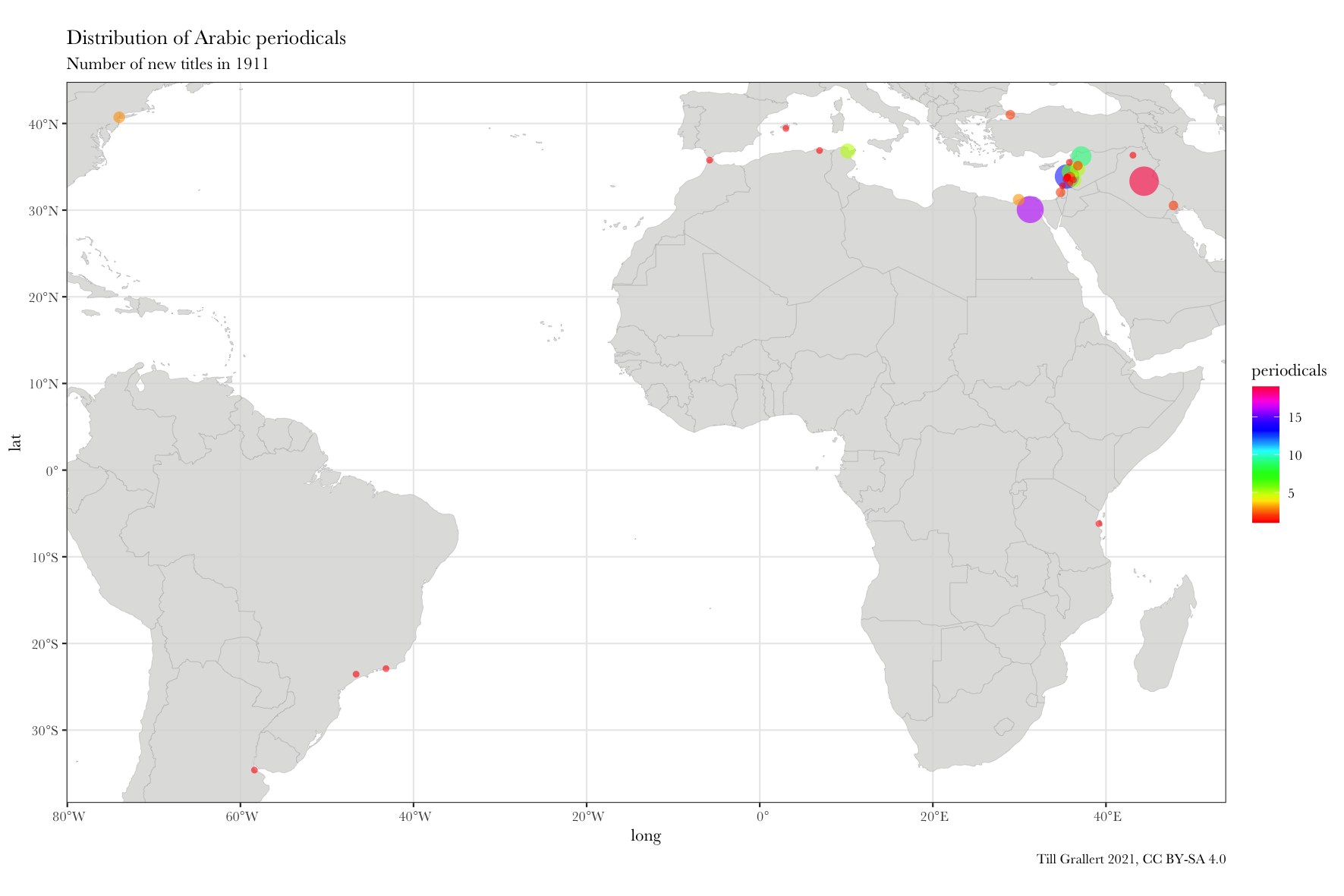
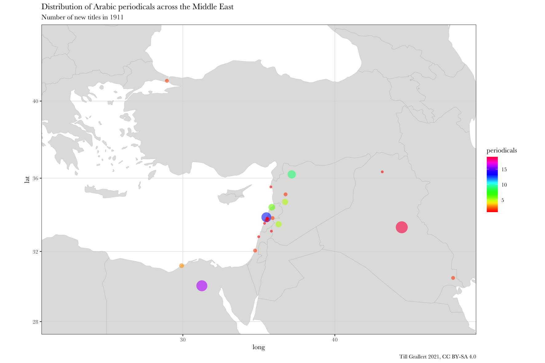
We can now use this function to see only periodicals published in 1911. We would learn that Lughat al-ʿArab was among 18 other new periodicals published that year in Baghdad and that in 1911 Baghdad had the largest number of new Arabic periodicals worldwide.
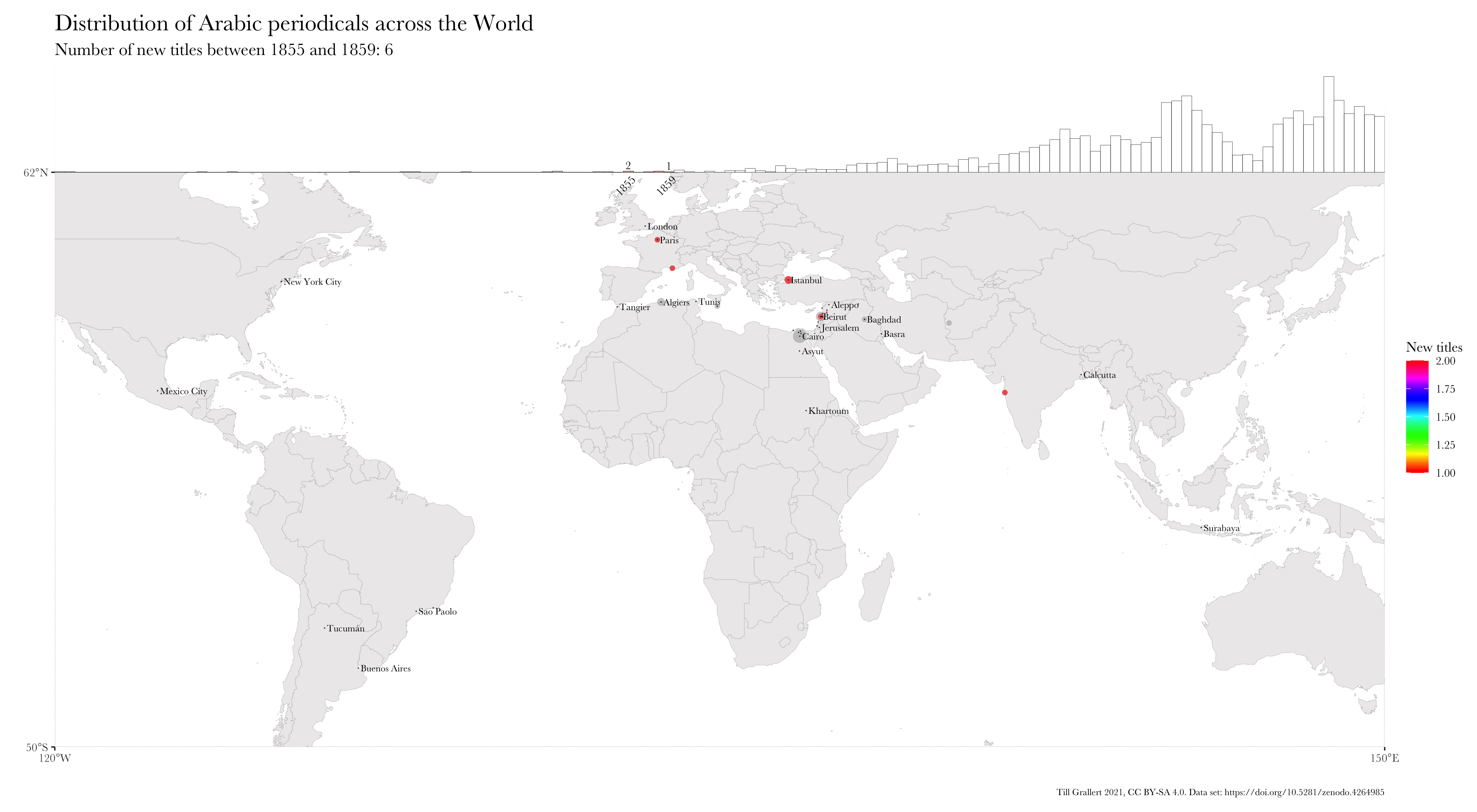
data.1911 <- f.filter.by.period(data.jaraid, 1911, 1)
head(data.1911)
# A tibble: 6 x 4
  location              lat  long periodicals
  <chr>               <dbl> <dbl>       <int>
1 Baghdad              33.3  44.4          19
2 Cairo                30.1  31.2          16
3 Beirut               33.9  35.5          13
4 Aleppo               36.2  37.2           9
5 Ṭarābulus (al-Shām)  34.4  35.8           6
6 Damascus             33.5  36.3           5
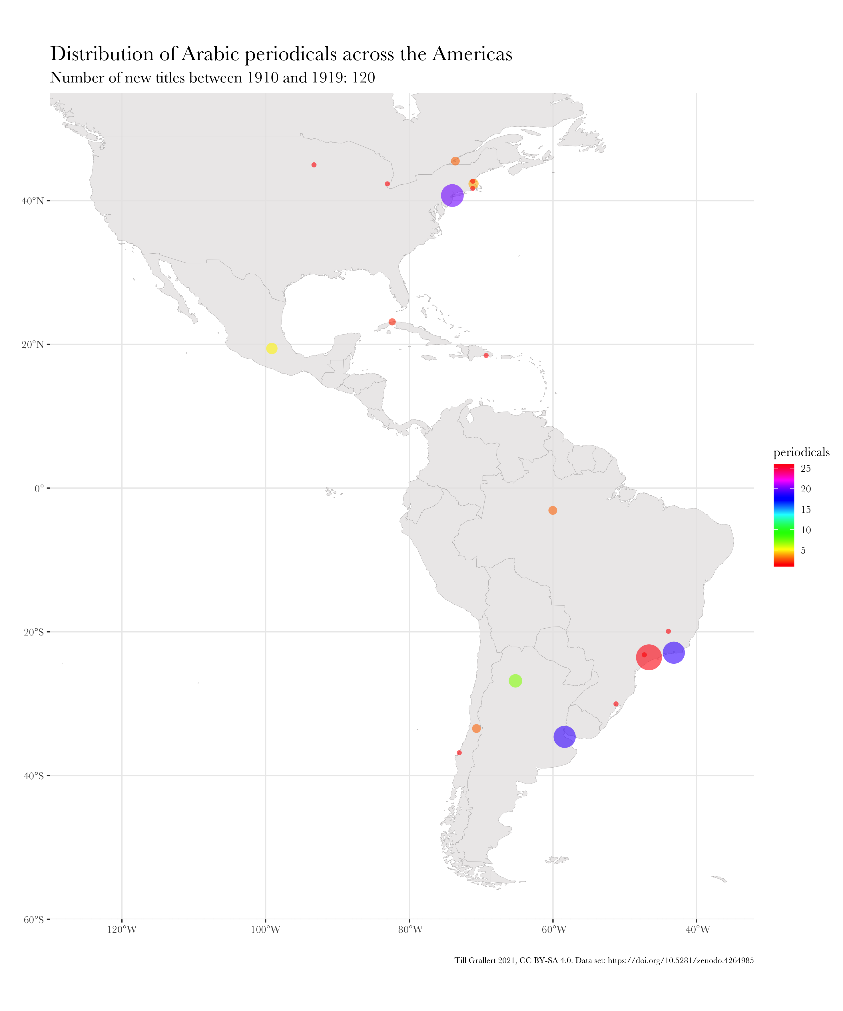
We can also use this function to aggregate periodicals by decade (or any other period)
# wrapper function for decades
f.filter.by.decade <- function(data.input, onset) {
f.filter.by.period(data.input, onset, 10)
}
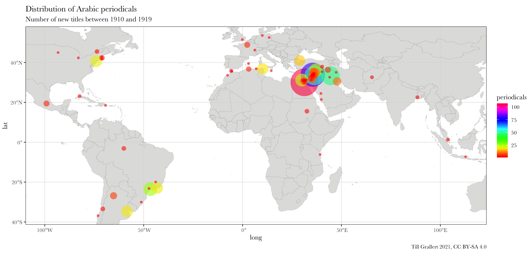
data.1910s <- f.filter.by.decade(data.jaraid, 1910)
head(data.1910s, n = 10L)
# A tibble: 10 x 4
location lat long periodicals
<chr> <dbl> <dbl> <int>
1 Cairo 30.1 31.2 107
2 Beirut 33.9 35.5 81
3 Damascus 33.5 36.3 53
4 Baghdad 33.3 44.4 49
5 São Paolo -23.5 -46.6 26
6 Aleppo 36.2 37.2 25
7 Alexandria 31.2 29.9 23
8 New York 40.7 -74.0 20
9 Buenos Aires -34.6 -58.4 19
10 Rio de Janeiro -22.9 -43.2 19
This shows that in the 1910s, 4 cities in the Arabic-speaking diaspora in the Americas became prominent places for the Arabic press.
Map the filtered data
In order to map multiple periods, we can wrap the above mapping commands into a function that takes a dataset, onset, and period as input.
f.map.periodicals.by.period <- function(data.input, onset, period, scale.colours) {
    # filter data by period
    data.period <- f.aggregate.by.period(data.input, onset, period)
    # variables:
    terminus = onset + period -1 # compute terminus to be reused in labels and file names
    font = "Baskerville" # set a pleasant font for the entire plot
    viewport.sf.data <- c(coord_sf(xlim = c(min(data.period$long, na.rm = T), max(data.period$long, na.rm = T)),
        ylim = c(min(data.period$lat, na.rm = T), max(data.period$lat, na.rm = T))))
    # base map
    map.sf.base <- ggplot() +
        geom_sf(data = ne_countries(scale = "medium", returnclass = "sf"), fill = "#d9d8d7", color = "#b8b6b6", size = 0.1, alpha = 0.8)
    # labels
    layer.labs <- labs(x="long", y="lat",
        title = "Distribution of Arabic periodicals",
        subtitle = paste("Number of new titles", ifelse(period == 1, "in", "between"), onset, ifelse(period > 1, paste("and", terminus, sep = " " ), ""), sep = " "),
        caption = paste("Till Grallert ", lubridate::year(Sys.Date()), ", CC BY-SA 4.0", sep = ""))
    # layer with dots: size is number of periodicals
    layer.periodicals <- c(geom_point(data = data.period,
        aes(x = long, y = lat, fill = periodicals),
        size = sqrt(data.period$periodicals) * 2,
        shape = 21, stroke = 0,alpha = 0.6))
    # compose map
    map.data <- map.sf.base + viewport.sf.data +
        # layers
        layer.labs + layer.periodicals +
        # colours, fonts, etc.
        scale.colours + guides(fill) + theme(
            text = element_text(family = font, face = "plain"),
            legend.position = "right")
    # save map
    setwd(here("visualization/maps"))
    ggsave(plot = map.data,
        filename = paste("map-periodicals_", onset, ifelse(period > 1, paste("-", terminus, sep = "" ), ""),".png", sep = ""), units = "mm" , height = 200, width = 300, dpi = 150)
    # plot map: necessary if one wants to save the output of the function in a variable
    map.data
}
We can now easily plot the above data for 1911 and the entire 1910s
f.map.periodicals.by.period(data.jaraid, 1911, 1, scale_fill_gradientn(colours = rainbow(20)))
f.map.periodicals.by.period(data.jaraid, 1910, 10, scale_fill_gradientn(colours = rainbow(20)))
Finally, we can also wrap this mapping function in another function to produce a sequence or time series of maps
f.map.periodicals.timeseries <- function(data.input, onset, terminus, period){
  for(i in onset:terminus) {
    f.map.periodicals.by.period(data.jaraid, i, period, scale_fill_gradientn(colours = rainbow(20)))
  }
}
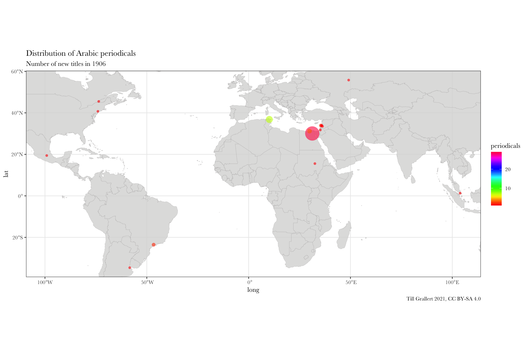
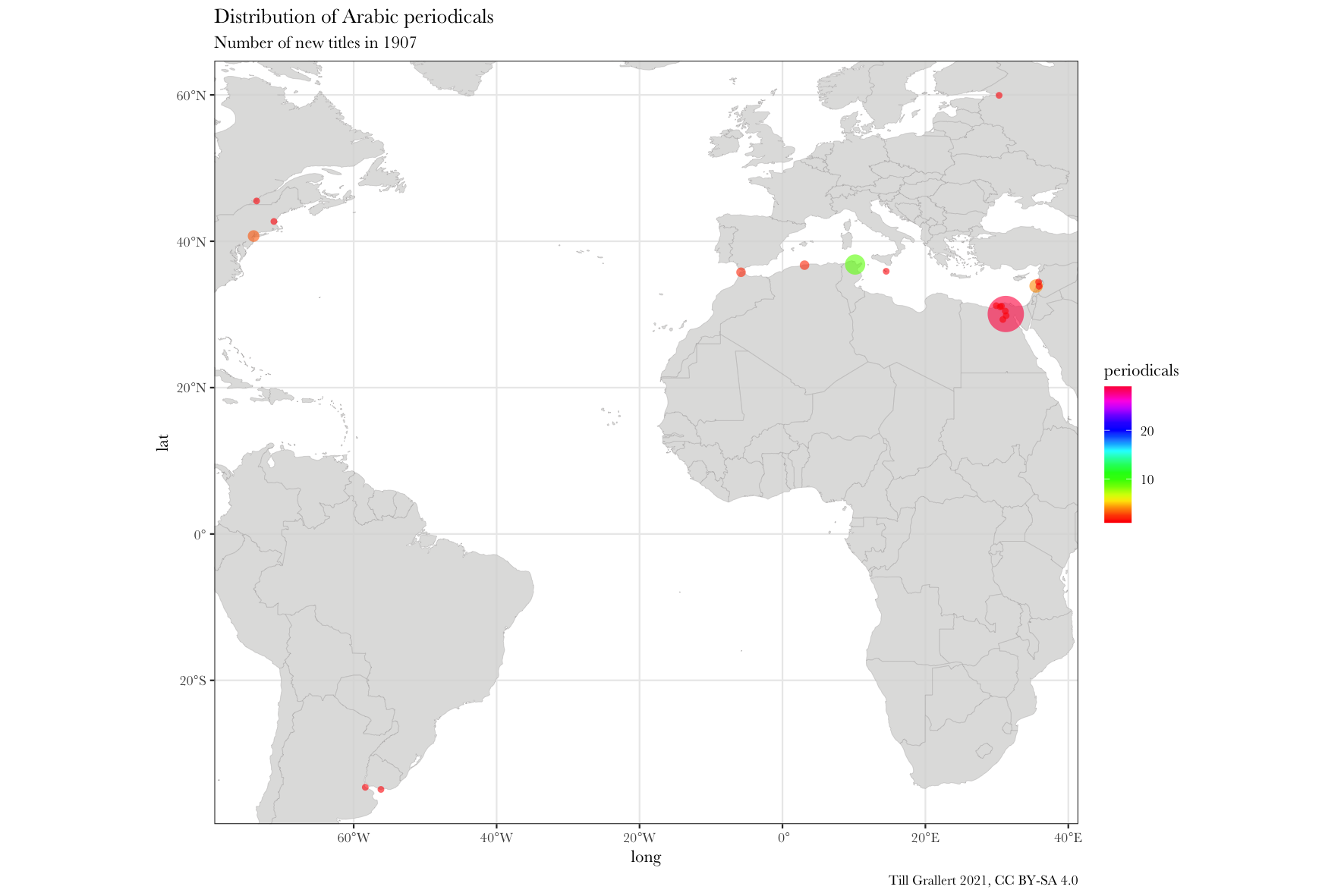
The following line will then generate a series of maps for five single consecutive years between 1906 and 1910.
f.map.periodicals.timeseries(data.jaraid, 1906, 1910, 1)
Further pre-processing the data: filter for region
These time series are great and one can peruse them for comparison. However, because we made the boundaries of the resulting map dependent on our data, each annual map will have different boundaries, which will prevent us from properly animating these maps (meaning, it should appear as if only the data was changing on a fixed background) with a GIF to show change over time. The solution to this problem is to set a fixed boundary box for the map. But since we also will want to add some summary information to the maps, we also need to filter the data with the same region.
# filter by region
f.filter.by.region <- function(data.input, region) {
  dplyr::filter(data.input,
                lat >= min(region$lat), lat <= max(region$lat),
                long >= min(region$long), long <= max(region$long))
}
# regions
region.middle.east <- tibble::tibble("long" = c(22, 48), "lat" = c(28, 43))
region.americas <- tibble::tibble("long" = c(-140, -35), "lat" = c(-55, 65))
We can now filter either our complete dataset or the subsets for periods by region:
:::{.c_width-50}
data.1911.middle.east <- f.filter.by.region(data.1911, region.middle.east)
head(data.1911.middle.east)
# A tibble: 6 x 4
# Groups:   location, lat [6]
  location              lat  long periodicals
  <chr>               <dbl> <dbl>       <int>
1 Baghdad              33.3  44.4          19
2 Cairo                30.1  31.2          16
3 Beirut               33.9  35.5          13
4 Aleppo               36.2  37.2           9
5 Ṭarābulus (al-Shām)  34.4  35.8           6
6 Damascus             33.5  36.3           5
::: :::{.c_width-50}
data.1910s.americas <- f.filter.by.region(data.1910s, region.americas)
head(data.1910s.americas)
# A tibble: 6 x 4
# Groups:   location, lat [6]
  location         lat  long periodicals
  <chr>          <dbl> <dbl>       <int>
1 São Paolo      -23.5 -46.6          26
2 New York        40.7 -74.0          20
3 Buenos Aires   -34.6 -58.4          19
4 Rio de Janeiro -22.9 -43.2          19
5 Tucumán        -26.8 -65.2           7
6 Mexico City     19.4 -99.1           5
:::
Before we can plot maps for this regionally subset data, we need another small helper function, which subsets the data to a specific region:
f.viewport.from.region <- function(region, projection){
  c(coord_map(xlim = c(min(region$long), max(region$long)), ylim = c(min(region$lat), max(region$lat)), projection = projection))
}
The two functions for filtering the dataset and for setting a fixed bounding box to the map can now be integrated into our main mapping function. To reduce the amount of code, I will only show the changes to the original function.
f.map.periodicals.by.period.region <- function(data.input, onset, period, region, scale.colours) {
  # filter data
  data.period <- f.filter.by.period(data.input, onset, period) # by period
  data.region <- f.filter.by.region(data.period, region) # by region
  # variables:
  region.label = unique(region$label)
  projection = "mercator"
  # viewport: based on the filtered data
  viewport.region <- f.viewport.from.region(region, projection)
  ...
}
We can now easily plot the above data for 1911 in the Middle East and the entire 1910s in the Americas
f.map.periodicals.by.period.region(data.jaraid, 1911, 1, region.middle.east, scale_fill_gradientn(colours = rainbow(20)))
f.map.periodicals.by.period.region(data.jaraid, 1910, 10, region.americas, scale_fill_gradientn(colours = rainbow(20)))
Map time series
The final step is to write small wrapper functions to produce (and save) time series of maps. These can be of two types: rolling or accumulating. A rolling time series will present slices of equal length in which each slice is independent of the one before. Each dot on the map represents the number of periodicals first published during the period of this slice. An accumulating time series, on the other hand, will add the data of the current slice to the previous slices. With these functions we have finally reached the point where we can produce regional time series, which can then be combined into an animated GIF.
Rolling time series
The basic idea is a loop that generates a map for a fixed period but with incremented onset. Hence, it runs in annual steps from onset until terminus but keeps the period in the function call stable.
# time series slices of equal length
f.map.periodicals.regional.timeseries.rolling <- function(data.input, onset, terminus, period, region, height, width){
  for(year in onset:terminus) {
    f.map.periodicals.by.period.region(data.input, year, period, region, scale.colours.rainbow, height, width)
  }
}
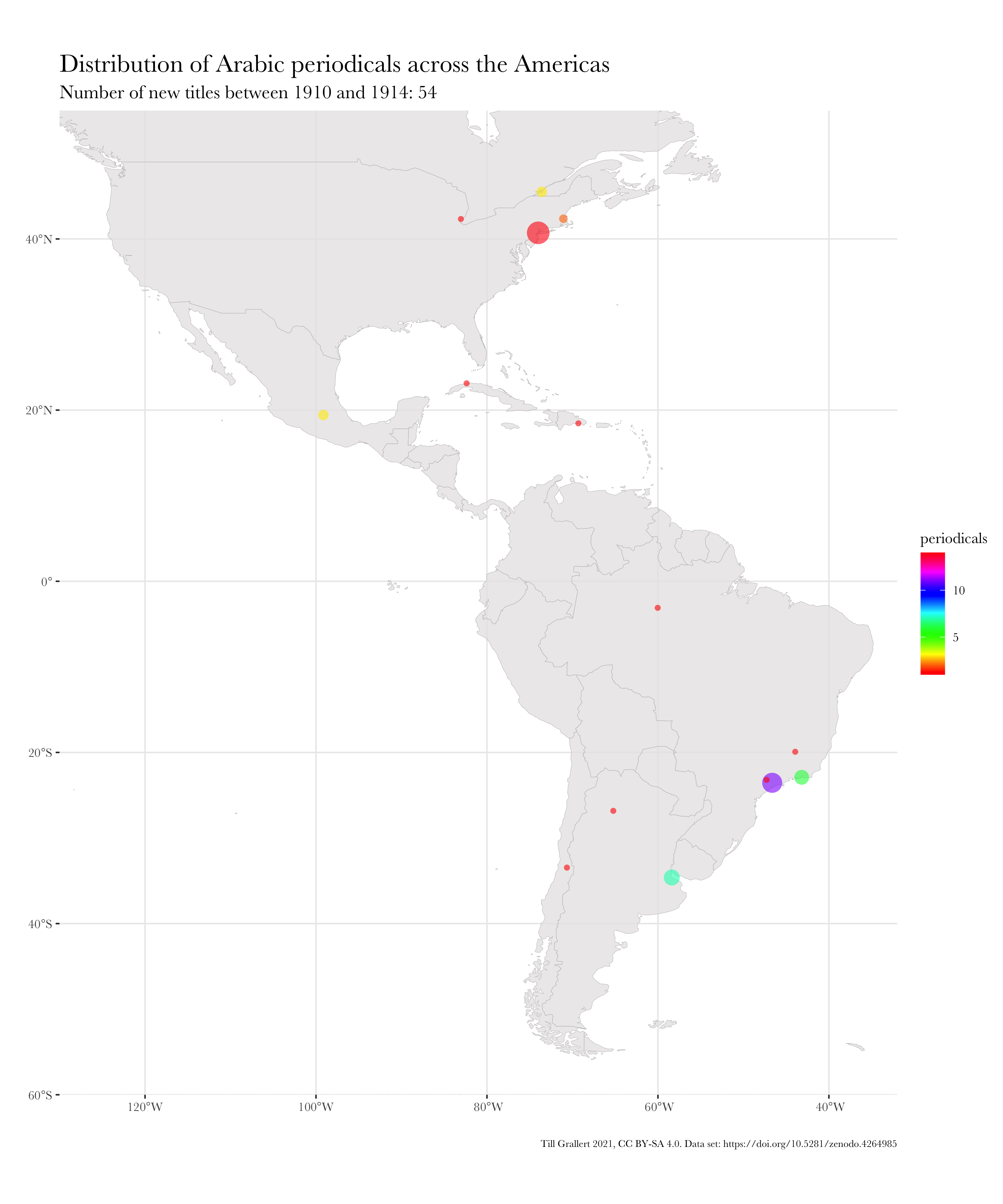
The following function call will now generate and save maps for Arabic periodicals published in the Americas for five rolling decades starting in 1910, 1911, 1912, 1913, and 1914.
f.map.periodicals.regional.timeseries.rolling(data.jaraid, 1910, 1914, 10, region.americas)

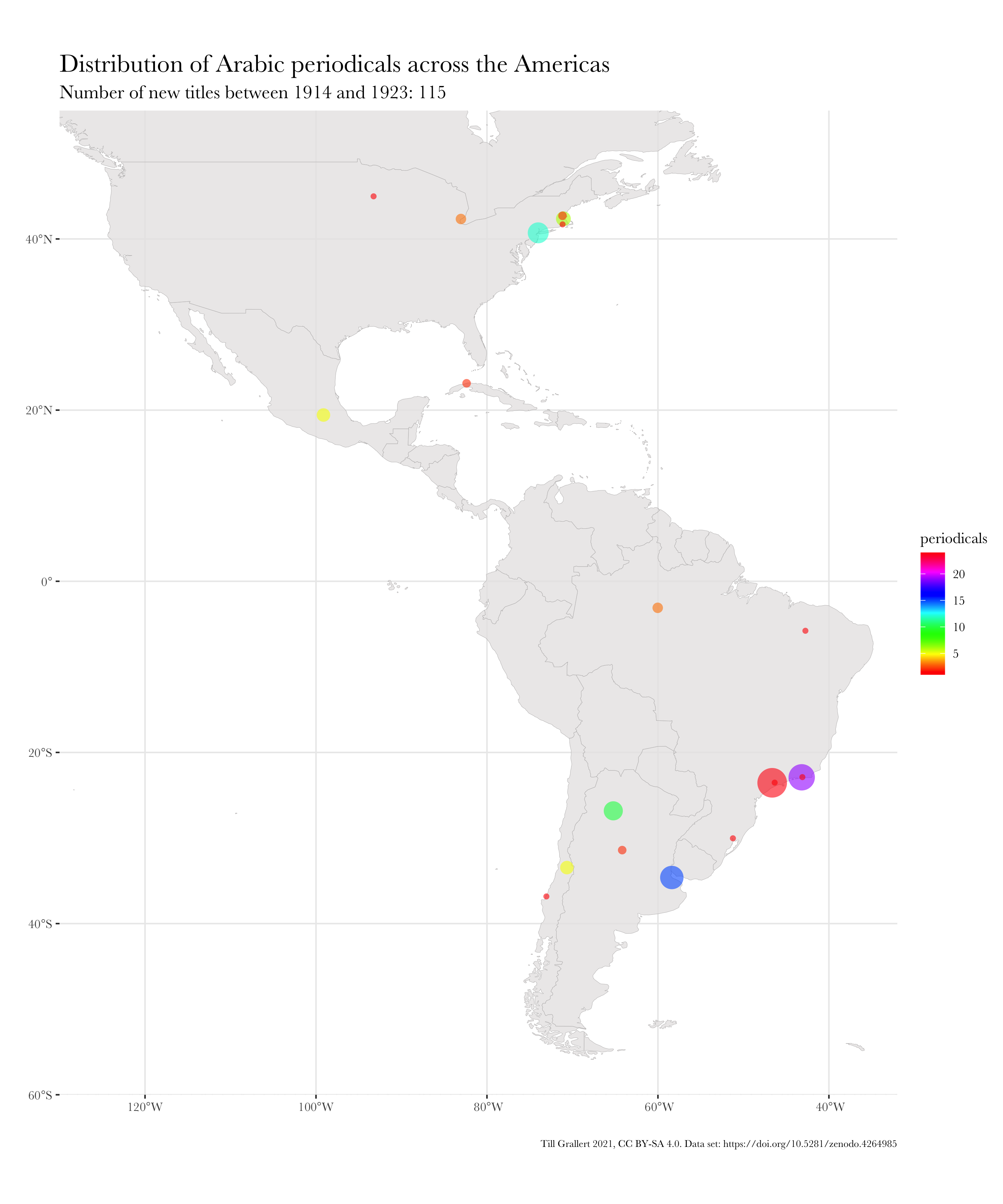
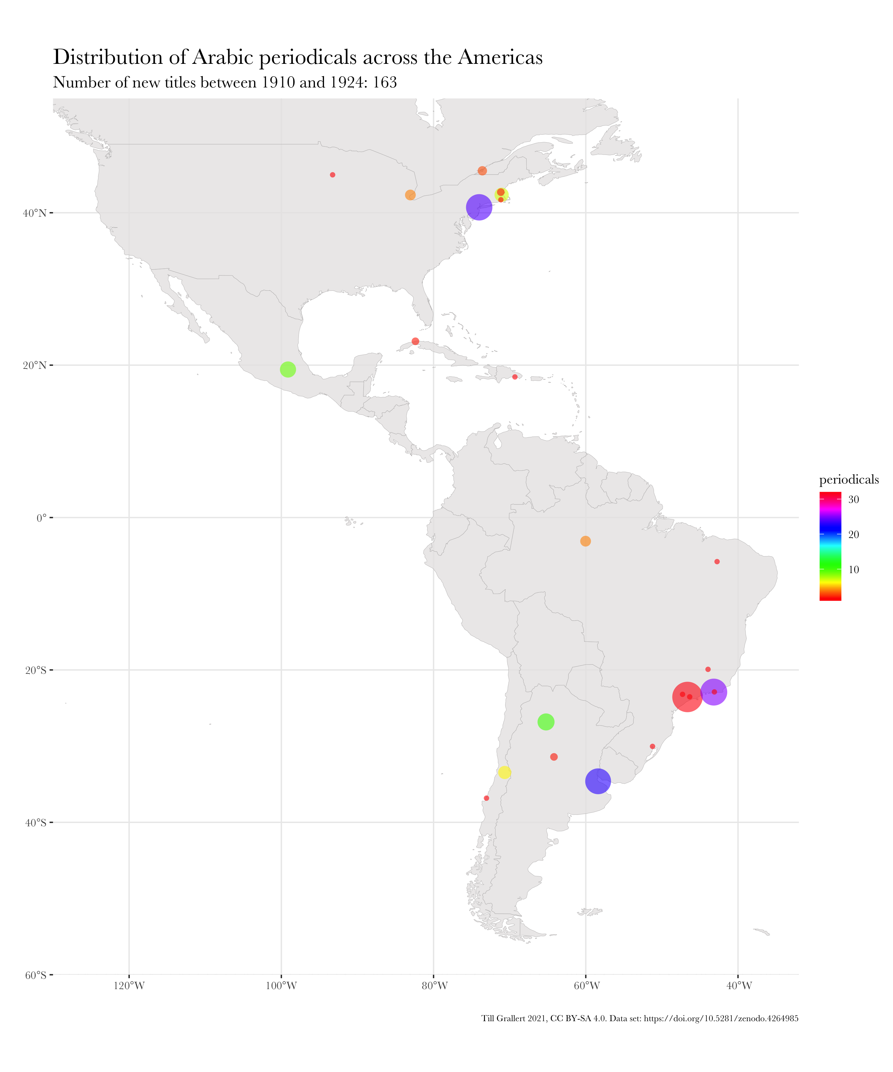
Accumulating time series
The basic idea is a loop that generates a map for a fixed period but with a fixed onset but an incremented terminus. Hence, it runs in annual steps from onset until terminus and increases the period by 1 for each step in the function call.
# time series between onset and terminus showing annual growth
f.map.periodicals.regional.timeseries.accumulating <- function(data.input, onset, terminus, region, height, width){
  period = terminus - onset + 1
  for(year in 1:period) {
    f.map.periodicals.by.period.region(data.input, onset, year, region, scale.colours.rainbow, height, width)
  }
}
f.map.periodicals.regional.timeseries.accumulating(data.jaraid, 1910, 1924, region.americas, 300, 250)
3. Combine images into a GIF
There are, as always, multiple local and online tools for combining images into animations. I will use the command line tool ImageMagick here as it free and open software and, for the limited purpose of the task at hand, rather simple to use.
The following commands will move into the output folder where the maps have been saved and will combine all regional maps for the Americas into a single GIF with a one-second delay between images.
# navigate into the folder holding the maps
cd visualization/maps
# MENA region
## single year
convert -loop 0 -dispose previous -delay 50 map-periodicals_MENA_{1865..1928}.png -delay 300 map-periodicals_MENA_1929.png map-periodicals_MENA_1865-1929-y_1.gif
## roling 5 year
cd ../y_5
convert -loop 0 -dispose previous -delay 50 map-periodicals_MENA_{1855..1924}-*.png -delay 300 map-periodicals_MENA_1925-1929.png map-periodicals_MENA_1855-1929-y_5.gif

# Middle East
## single year
cd ../y_1
convert -loop 0 -dispose previous -delay 50 map-periodicals_ME_{1865..1928}.png -delay 300 map-periodicals_ME_1929.png map-periodicals_ME_1865-1929-y_1.gif
## roling 5 year: use subfolders
cd ../y_5
convert -loop 0 -dispose previous -delay 50 map-periodicals_ME_{1855..1924}-*.png -delay 300 map-periodicals_ME_1925-1929.png map-periodicals_ME_1855-1929-y_5.gif

# World
## single year
convert -loop 0 -dispose previous -delay 50 map-periodicals_World_{1865..1928}.png -delay 300 map-periodicals_World_1929.png map-periodicals_World_1865-1929-y_1.gif
## roling 5 year
cd ../y_5
convert -loop 0 -dispose previous -delay 50 map-periodicals_World_{1855..1924}-*.png -delay 300 map-periodicals_World_1925-1929.png map-periodicals_World_1855-1929-y_5.gif
## roling 10 year
cd ../y_10
convert -loop 0 -dispose previous -delay 50 map-periodicals_World_{1855..1919}-*.png -delay 300 map-periodicals_World_1920-1929.png map-periodicals_World_1855-1929-y_10.gif
The options are:
-loop: the number of loops the animation goes through. If set to “0”, it will cycle indefinitely.-delay: the time between image changes in 1/100 of a second-dispose previous: this discards the previous slice and avoids layering
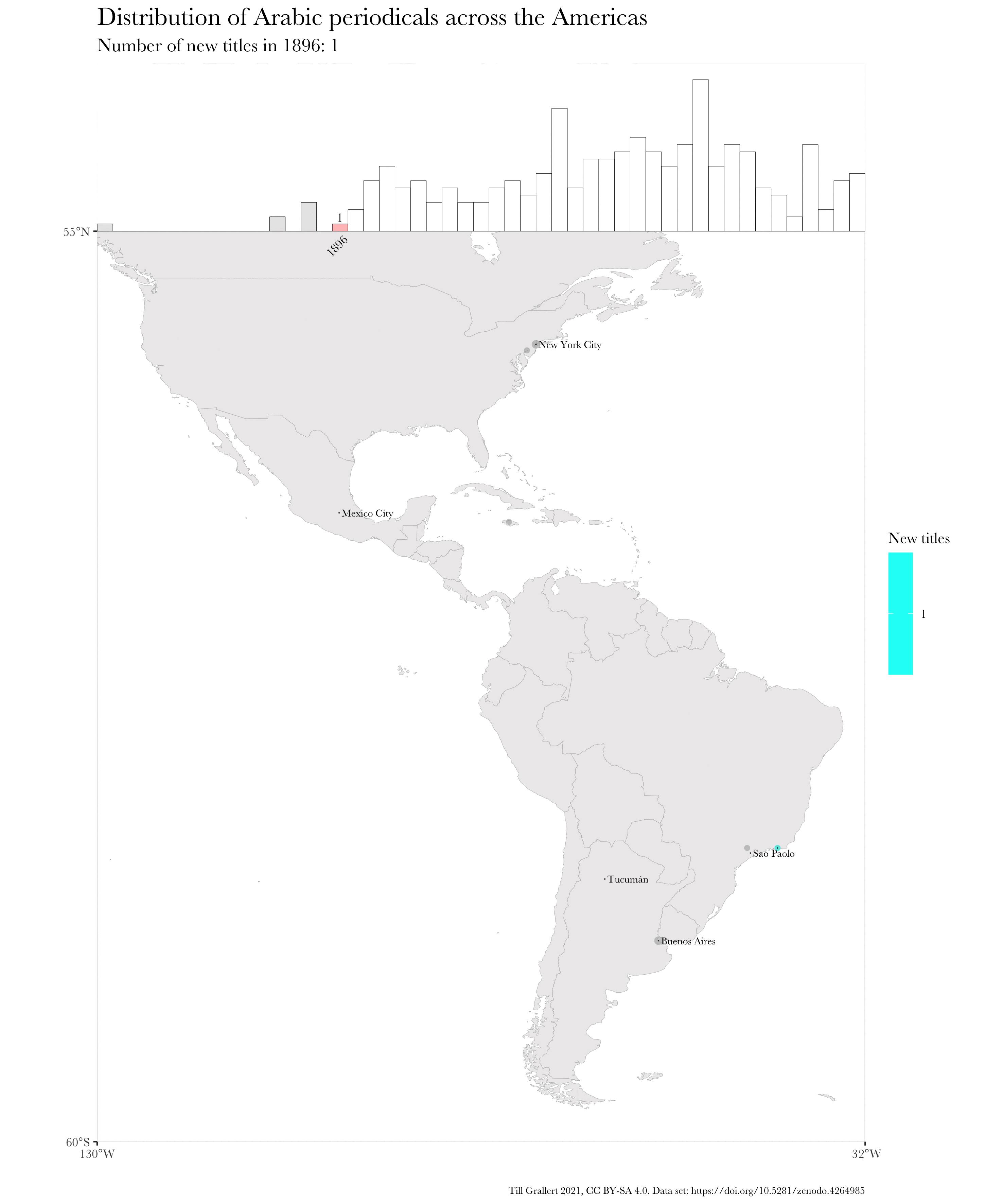
And here is, finally, the resulting, animated map of an accumulating time series. Note that I have used further augmented maps for this GIF.
Bibliography
::: {#refs .references .hanging-indent} ::: {#ref-Albers+2020} Albers, Yvonne. 2020. ‘Die Zeitschrift als Krisengenre: Mawāqif (1968-1994). Eine Biografie’. Marburg: Philipps-Universität Marburg. :::
::: {#ref-Mestyan.etal+2020+JaraidChronologyArabic} Mestyan, Adam, Till Grallert, and et al. 2020. ‘Jarāʾid: A Chronology of Arabic Periodicals (1800-1929)’. Zenodo. https://doi.org/10.5281/zenodo.4399240. :::
::: {#ref-Tarrazi+1933} Ṭarrāzī, Fīlīb dī. 1933. Tārīkh al-ṣiḥāfa al-ʿarabiyya: yaḥtawī ʿalā jamīʻ fahāris al-jarāʾid wa al-majallāt al-ʿarabiyya fī al-khāfiqīn mudh takwīn al-ṣiḥāfa al-ʿarabiyya ilā nihāyat ʿām 1929. Vol. 4. Bayrūt: al-Maṭbaʿa al-Amīrikāniyya. http://hdl.handle.net/2333.1/crjdfsp1. ::: :::